In some projects, illustrations may also need to be edited. The illustration editor may need to select which illustrations to use, and process those illustrations. This may include cropping parts of the image, removing some parts, blurring parts to be hidden, balancing the colour, sharpening the image, and so on. As an editor, you may not be involved in this, but you may need to ensure that all illustrations are where they should be, that they fit in with the text, that they look right, and so on.
As well as images, illustrations can include drawings, diagrams, charts, graphs - or any other type of graphic. When editing illustrations some of the things to think about are:
- Does the illustration add to the text? If not, it might be better to remove it.
- Is it self-explanatory? Or does it need to be explained further in the text?
- Does the image need to be cropped to fit in the space?
- Has a cropped image had the wrong part cropped off?
- Does an image need to be enlarged? Will image quality suffer as a consequence?
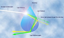
- Do graphs, tables and charts make sense? Would a lay person understand them?
- Are any symbols used easily recognised or is a legend needed?
- Are the illustrations labelled accurately (and in accordance with publisher's guides)?
- Do columns, arrows, or other symbols line up properly?
Any illustration should contribute to the document. It should be self-explanatory, clear, and enhance the reader's enjoyment and understanding.
There are also differences with regards to printed and online illustrations. For instance, an online illustration must fit into a typical computer screen width. If the viewer has to scroll from side to side to read it then this is not only inconvenient but the document loses much of its impact. Also, most people are going to view online illustrations using an average computer with an average monitor using average resolution. If your illustrations are too high resolution then the detail will be lost on many computer screens and may in fact look quite awful. Similarly, too low a resolution will look drab on a high end computer system. If you aim for the middle ground you'll satisfy the most people.
 You would also have to check that the fonts used and background colours do not make it difficult to read any accompanying text. How many times have you given up reading an article on a website because it was displayed in garish colours or you struggled to read it? On websites, you should also think about how long a document takes to download for the end-user. Many people will give up on web pages which take too long to load. Test out online documents using average computer equipment and an average speed modem to assess their readability before publication.
For printed illustrations there are other considerations. The cost of publishing may mean that colour illustrations have to be printed in black and white. However, some illustrations such as bar charts and pie charts may lose their effectiveness if printed in black and white. Is there another way the information could be presented? A photograph with little variation in tone or contrast may become difficult to discern if printed without colour
This article is an extract from our ebook on Editing. Click here for more details